

Comprehensive Uniform Design & History
“The first question I’m asked is, ‘WHY?’”
-Late Broncos Owner, Pat Bowlen on the 1997 uniform change.
Introduction
The Denver Broncos had a moniker, made famous by their bright orange uniforms and stifling defense, “The Orange Crush” was a force to be reckoned with. But four decades into the franchise’ existence they had yet to win a super bowl. It was time for a new look, a complete revival, so in 1997 the late Pat Bowlen, majority owner and CEO at the time, drew up a hail Mary play: a complete overhaul and rebrand. “The first question I’m asked is, ‘Why?’”, Bowlen said when addressing the change. “The best answer is I’ve always wanted to be No. 1 in everything. That’s my mission, the organizations mission. And I felt that playing in uniforms that essentially have been the same for 30 years was not moving in that direction. I felt we needed a change.”
Bowlen had taken ownership of the Broncos 13 years prior to the rebrand in 1984, but the uniforms hadn’t been revisited since the colors were changed from brown and gold to orange, blue and white in 1963.
So, True to his word, Bowlen and the Broncos would make a change that would not only be a defining move in Broncos history, but would change the way Uniforms were made and designed.
Finally becoming No. 1 in the process.
-
![]()
Brown and Gold Uniforms Circa 1960
-
![]()
Brown and Gold Uniforms Circa 1960
-
![]()
John McCormick
-
![]()
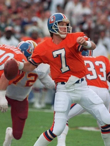
John Elway- Orange Crush Uniform
-
![]()
1997 Uniform Reveal
-
![]()
John Elway Celebrating the Super Bowl 32 Victory
-
![]()
L to R: Terrel Davis, Pat Bowlen, John Elway


The Orange Crush
In 1960 the Denver Broncos arrived for their inaugural season brandishing a brown and gold color scheme that left a sour taste in the collective palette of fans and players alike, anchored by vertically striped socks that could be described as an afront to the human eye. But while these universally hated uniforms weren’t a product of bad branding, and rather a tight budget, the Broncos were none too quick to make a change.
And after two short years the Broncos would make that change, now brandishing Orange, and white, with completely orange helmets and a new bucking horse logo with a football player rider. The team would make one last change and go on a nearly four decade ride in bright Orange, Royal Blue, and white, and would introduce Blue helmets with their now iconic white stallion emerging from the orange “D” logo.
In four decades the team would make four super bowl appearances, and develop a defense that would come to be known as “The Orange Crush”. The moniker alluded to the color of the uniforms, and took inspiration from the soda brand, but the defense made it their own. They would lead the Broncos to their first super bowl appearances in 1977, in a face off with the Dallas Cowboys, a game in which they fell 27-10.
Over the next 12 years the Broncos would it to the big game three more times, 1986, 1987, and 1989. They would wear their white uniforms in ‘86, and orange in the following two games, losing all three as well.
Despite the lack of super bowl success in the Orange Crush uniforms they were always fan favorites, they had their own charm, and were defining and bright in comparison to all other NFL uniforms at the time.
But success is the name of the game and in 1997, Pat Bowlen, who had owned the team for 13 years up to then, knew it was time to move on from a look that had defined Bronco football for nearly 40 years.
-
![]()
B. Jackson, R. Carter, R. Gradishar
-
![]()
Randy Gradishar and Joe Rizzo
-
![]()
Randy Gradishar
-
![]()
B. Thompson and B. Jackson
-
![]()
Haven Moses


New Look, New Era
When Pat Bowlen approached NIKE with the task of redefining the Denver Broncos, they took the opportunity to not only revolutionize what the sports logo could be but also how uniforms were designed and the technology they could employ. Featuring a brand new number set, font, and color scheme, these uniforms shocked the football world and ushered in a new era of uniform design.
The design team at NIKE would focus first and foremost on the new logo, Bowlen wanted a horse logo that looked like it could “kick your ass”. Drawing inspiration from the Native American legend of the ghost horse, the logo is predominantly white, but the texture in the neck was meant to represent the various natural occurrences, such as earthquakes and tsunamis. The eye looks deep into your soul and the orange in the mane represents the fiery spirit of the horse.
This logo was a major departure from what NFL logos had been up to that time. Not only did it move away from the cartoon aesthetic of yesteryear, but provided a modern and more aggressive approach to what representation of a team could be.
The logo wasn’t the only major change though, through the rebrand the entire color palette for the Broncos changed as well, transitioning from a bright baby blue and neon orange to navy blue and burnt orange. Though the change was unpopular with much of the fan base it was an undoubted improvement when it came to on field presence and even performance.
One of the most popular sayings in all of sports is, “Feel good, Play good,” and in the opinion of Steve Atwater, former Broncos safety and Pro Football Hall of Famer, “Navy blue is meaner than orange”.
Well, the Broncos took that feel good saying to heart, winning back to back Super Bowls in the new look, defeating the heavily favored Green Bay Packers in the Navy Blues in Super Bowl 32 and the Atlanta Falcons while wearing the Whites in Super Bowl 33.
These uniforms also employed a new fabric and stitching technology that at first glance might be unsightly. But ultimately the “Batwing” paneling that runs up the sides of the jersey would assist in form fitting it to the athlete, while still allowing them to be more mobile than ever. The team at Nike turned to designer David Turner, who had been developing new prototypes for football uniforms, to create a new jersey design. Rick Bakas, Broncos fan and assistant designer, described it as a “natural fit and lucky timing,” that Turners “Batwing” design worked well for the Broncos new outfitting.
The “wing” panel under the arm allowed the jersey to sit more flush along the body, while also allowing the jersey to be crafted with multiple different materials and improve its durability. The development of this uniform technology and the use of the panel as an element of design not only made it easily recognizable as that of the Denver Broncos, but revolutionized what a uniform design could be. With one stroke of design genius, the baggy jersey had effectively been removed from the game of football.
-
![]()
Ghost Horse Logo
-
![]()
Number Set
-
![]()
Helmet Design
-
![]()
1997 Uniforms
-
![]()
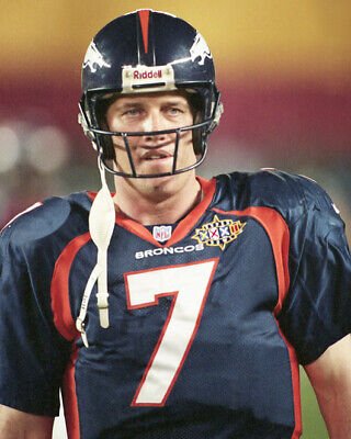
Navy Blue Uniform - Super Bowl 32
-
![]()
White Uniform - Super Bowl 33


Made for Mile High
Say what you will about the Broncos look for the last 27 years, what someone simply can’t deny is that they were successful in it. Three Super Bowl Championships followed the 1997 change, a feat that was simply never accomplished in the Orange Crush Uniforms.
But in late 2022 the rumors began to circulate, was a uniform refresh happening in Denver? About a year and a half later, Broncos country would get their answer: 4.22.24.
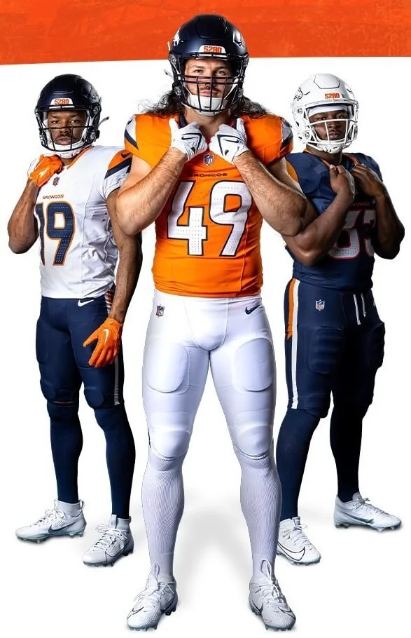
On Monday the 22nd of April, 2024 the new look in Denver had arrived, and just as its predecessor before it, the change has polarized Broncos fans. Now ditching the “Batwing” panel design that no longer served a purpose, aside from stylization, the new look draws heavy inspiration from the Mountain ranges surrounding the city of Denver, as well as the city’s mile high elevation.
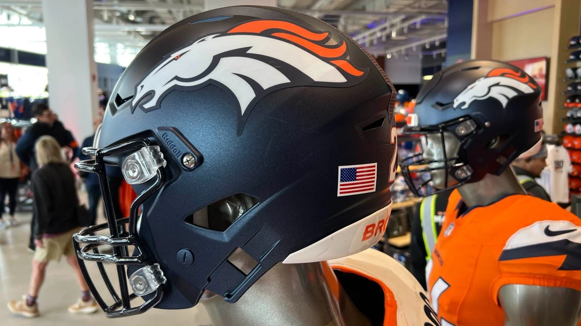
The overhaul includes a new helmet design, featuring two primary helmets of a matte navy blue and a glossy white. The number 5280, representing Denver’s mile high elevation, is a 3D sticker pasted onto the front bumper of the helmet, just above the facemask. The main helmet stripe no longer reaches all the way around, and instead stops just before the crest of the helmet, the new stripe features triangle imagery and creates an upward pointing arrow, representing the high elevation of Denver, Colorado.
Now using the NIKE F.U.S.E. jersey template as a base, the overall color palette remains the same, three variations of Midnight Navy, Sunset orange, and Summit white. The sleeves feature a mountain peak with jagged notch cutout that represents the rugged terrain of the Rocky Mountains. The notch is taken directly from the angle of the upper jaw in the Broncos primary logo. The shoulder curve that surrounds the NIKE logo is meant to represent the rising of the sun and “dawn of a new day”.
The Triangles used on the helmet are also featured throughout all three jersey variations, and can be found on the back collar, under the arms and inside the numbers. These triangles symbolize more than a few things, each one resembles a summit marker that represents the idea of reaching the peak of the proverbial mountain. Within the numbers, the triangles are densely packed towards the bottom and disperse as you look up the number, representing the lack of oxygen the higher in elevation one goes. Finally the triangles under the sleeve further emphasize both of the aforementioned details, but the significance of three points is the representation of the three Super Bowl championships the franchise has won.
The new pants are less stylized, including a basic pant length stripe with “5280” placed vertically within it, and a secondary stripe that ends at an angle, that symbolizes a mountain peak.
Much of Broncos country has been apprehensive about the new look, at best, and it’s yet to be seen how the design with look on field and how this Broncos team will perform in their new digs. But one thing is for certain, this is a new movement in Denver, one that hopes to usher in youth and success. People didn’t like the change in 1997, but success would end up boosting it’s longevity, and its hard to say what many wouldn’t give to see a similar resurgence from this team. So come fall 2024, dawning a new look and hoping for a mile high turn around, perhaps this team can ascend to the peak of the NFL once more.
(Tap to enlarge)
(Tap to enlarge)
(Tap to enlarge)
-
![]()
Sunrise Orange - via SportsLogos.net
-
![]()
Summit White - via SportsLogos.net
-
![]()
Midnight Navy - via SportsLogos.net
-
![]()
2024 Matte Navy Helmet - Via Denver 9News
-
![]()
LtoR: M. Mims Jr., A. Singleton, J. Williams


Sources:
Athletic, Special to The. “Behold the Batwing: How the Denver Broncos and Nike Teamed up and Forever Changed Uniform Design.” The Athletic, theathletic.com/249283/2018/02/22/behold-the-batwing-how-the-denver-broncos-and-nike-teamed-up-and-forever-changed-uniform-design/. Accessed 5 May 2024.
“Denver Broncos.” Www.denverbroncos.com, 22 Apr. 2024, www.denverbroncos.com/uniforms/. Accessed 5 May 2024.
Denver Broncos History – Mile High Heritage. history.denverbroncos.com.
Lind, Andrew. “Denver Broncos Unveil New “Mile High” Uniforms, Revive Throwback Design – SportsLogos.net News.” News.sportslogos.net, 22 Apr. 2024, news.sportslogos.net/2024/04/22/denver-broncos-unveil-new-mile-high-uniforms-tease-throwback/football/. Accessed 5 May 2024.
Mason, Andrew. “Mason’s Mailbag: A Look Back at the Broncos’ 1997 Uniform Change.” Www.denverbroncos.com, 31 Mar. 2019, www.denverbroncos.com/news/mason-s-mailbag-a-look-back-at-the-broncos-1997-uniform-change. Accessed 5 May 2024.
Wikipedia. “Denver Broncos.” Wikipedia, 4 Oct. 2020, en.wikipedia.org/wiki/Denver_Broncos. Accessed Apr. 2024.